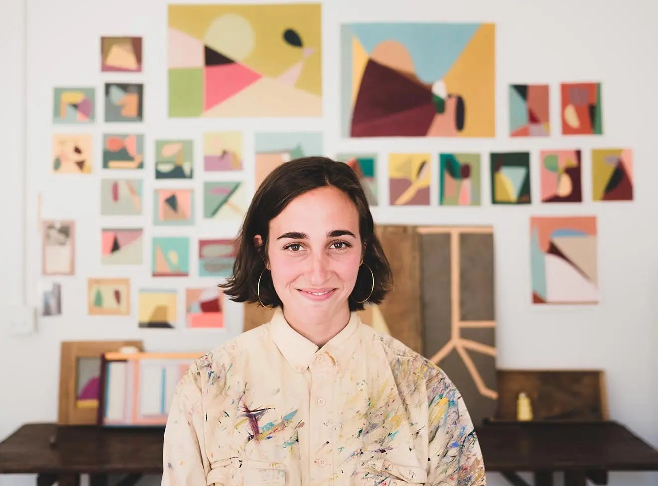
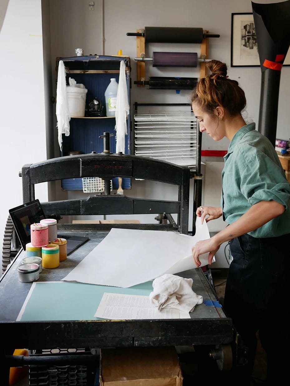
Behind the Print Series / Edition 1
We partnered with four different Brooklyn print studios to create an exclusive suite of prints by four Uprise Art artists. Limited-edition, numbered, and signed, these prints arrive framed and are perfect for gifting.
Adrian Kay Wong x Haven Press
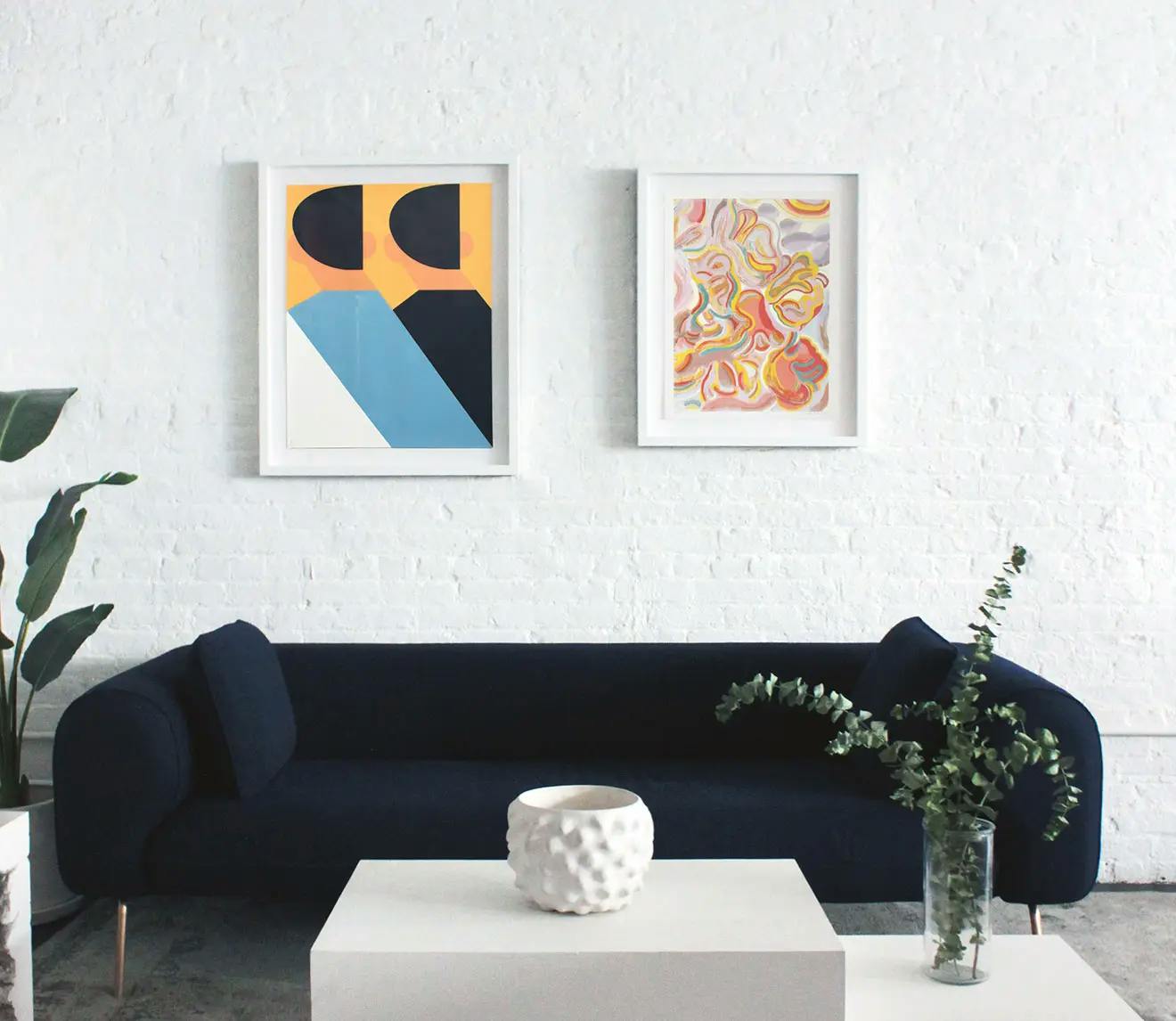
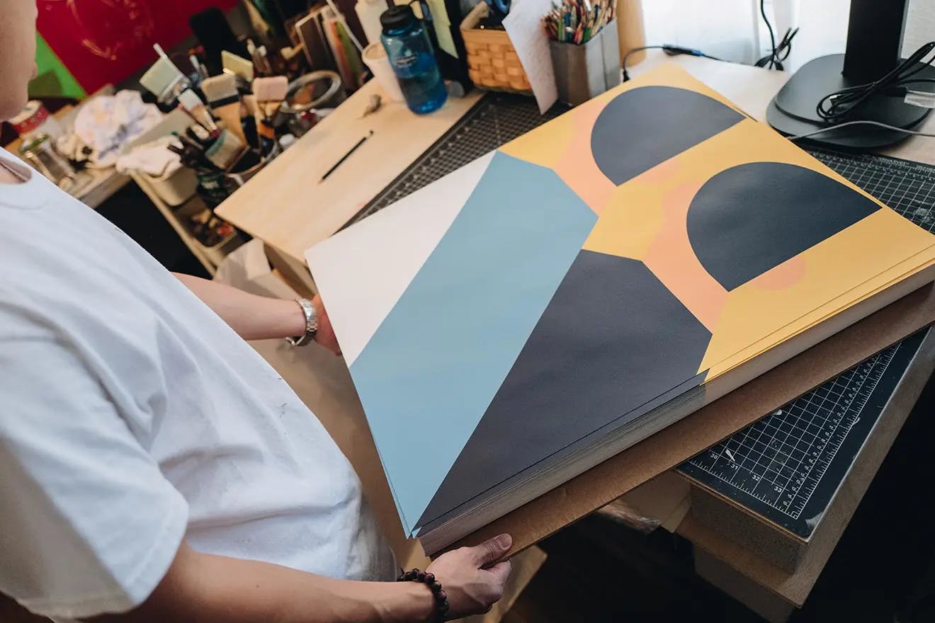
Haven Press translated Adrian Kay Wong’s schematic painting One and Two and... (Corner) to create a four-color screen print that features raw paper in the bottom left corner. Adrian describes the print as a return to one of his earliest paintings which "preserves the same fundamental elements that have always been a part of my work", yet is "executed with newer sensibilities."
The artist goes on to describe the piece: "The graphic quality of the minimal, yet prominent color shapes emphasizes the 'blocking out' nature of not only my painting approach, but the printmaking process too. By exposing an unprinted corner of the print, we pay homage to the surface quality of the paper as well as recognizing negative space as a potential form in the parallel, slanted bodies."
Mark Herschede, the founder of Haven Press, worked closely with Adrian to perfect the colors of the work. He highlights that "the works are emblematic of screen printing’s strengths: strong, flat colors applied in large fields with crisp edges that form a composition at first deceptively simple yet not unlike a puzzle in its actual complexity."
Erin Lynn Welsh x Du-Good Press
Du-Good Press took a detail from Erin Lynn Welsh’s textured, impasto painting style for the 15-layer screen print Glory, with varying transparencies and alternating glossy and matte inks.
The artist speaks about the printmaking method, mentioning that "throughout the process, I was able to experiment with color theory and how it applies to printing as compared to painting. What really blew my mind was the way Leslie at Du-Good Press was able to capture the textural detail of my paint strokes, taking the lush thickness of oil on canvas and translating it into a flat print."
Leslie Diuguid, the founder of Du-Good Press, worked closely with Erin to perfect the palette. Speaking to the unique color combination, Leslie talks about finding the right balance: "chartreuse and delicate pinks play a role in opposing each other and coming together in times of neutrality. Her color scheme is a scientific balance of transparent overlays coming and going to blend in and disappear into one another yet accentuated by bold reds and and calming blues."
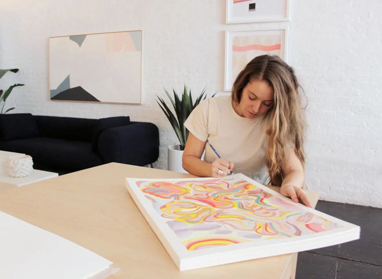
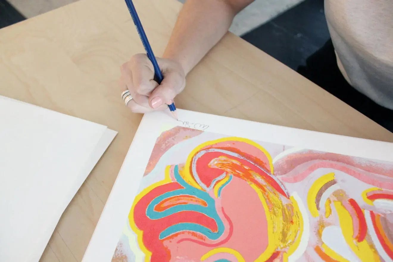
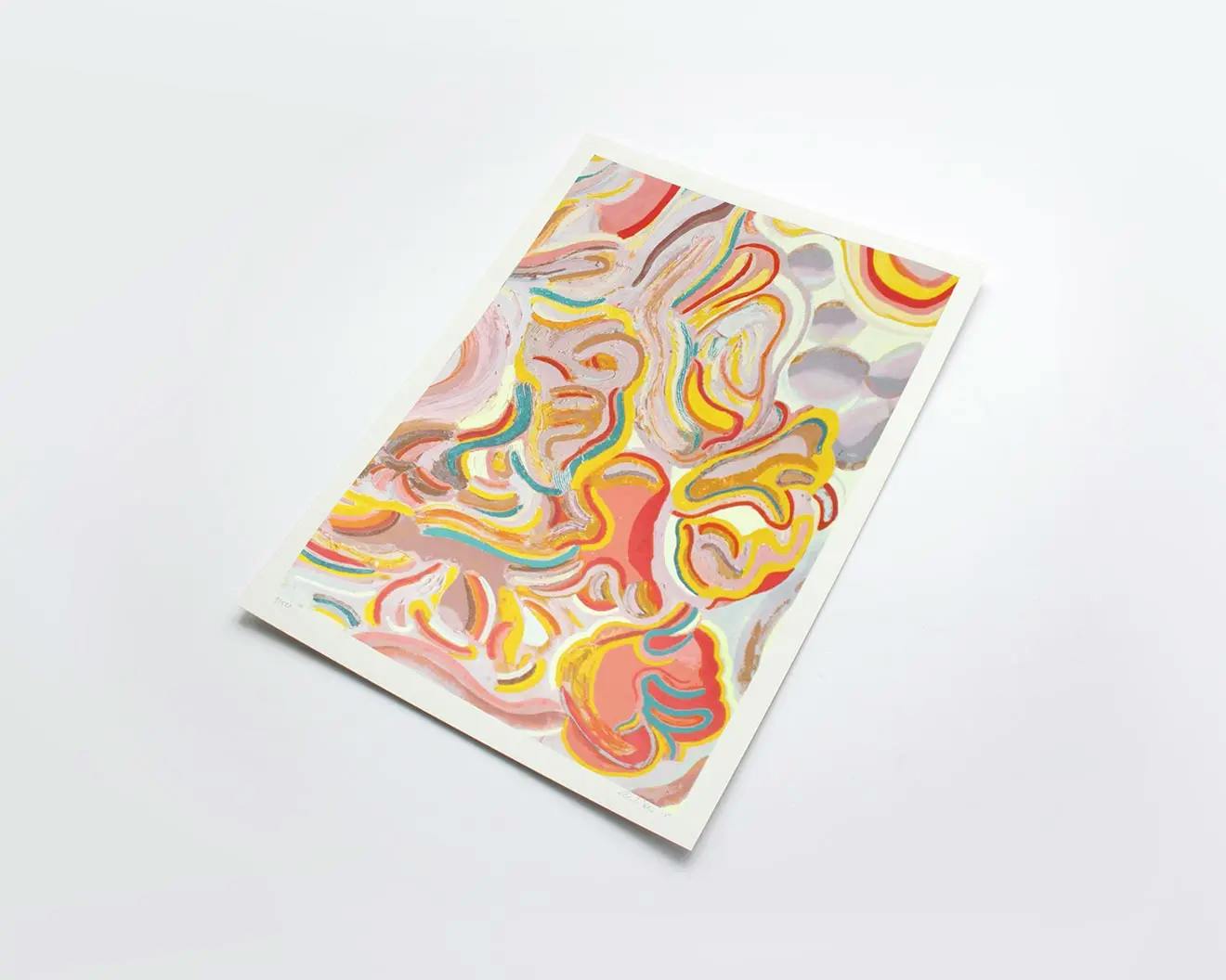
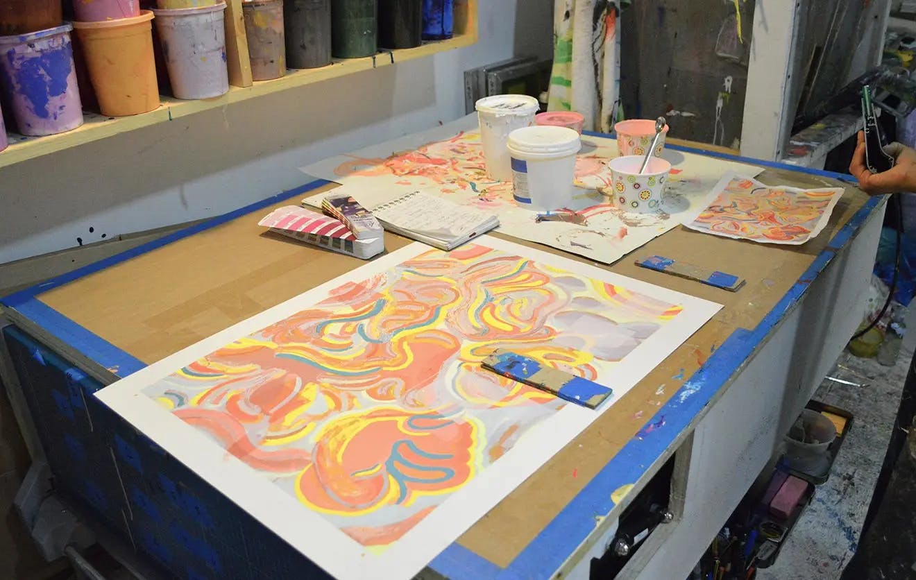
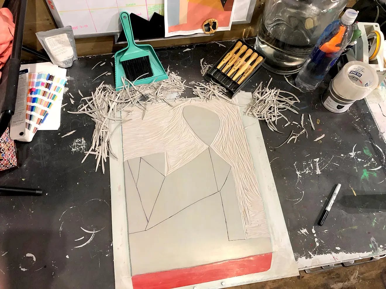
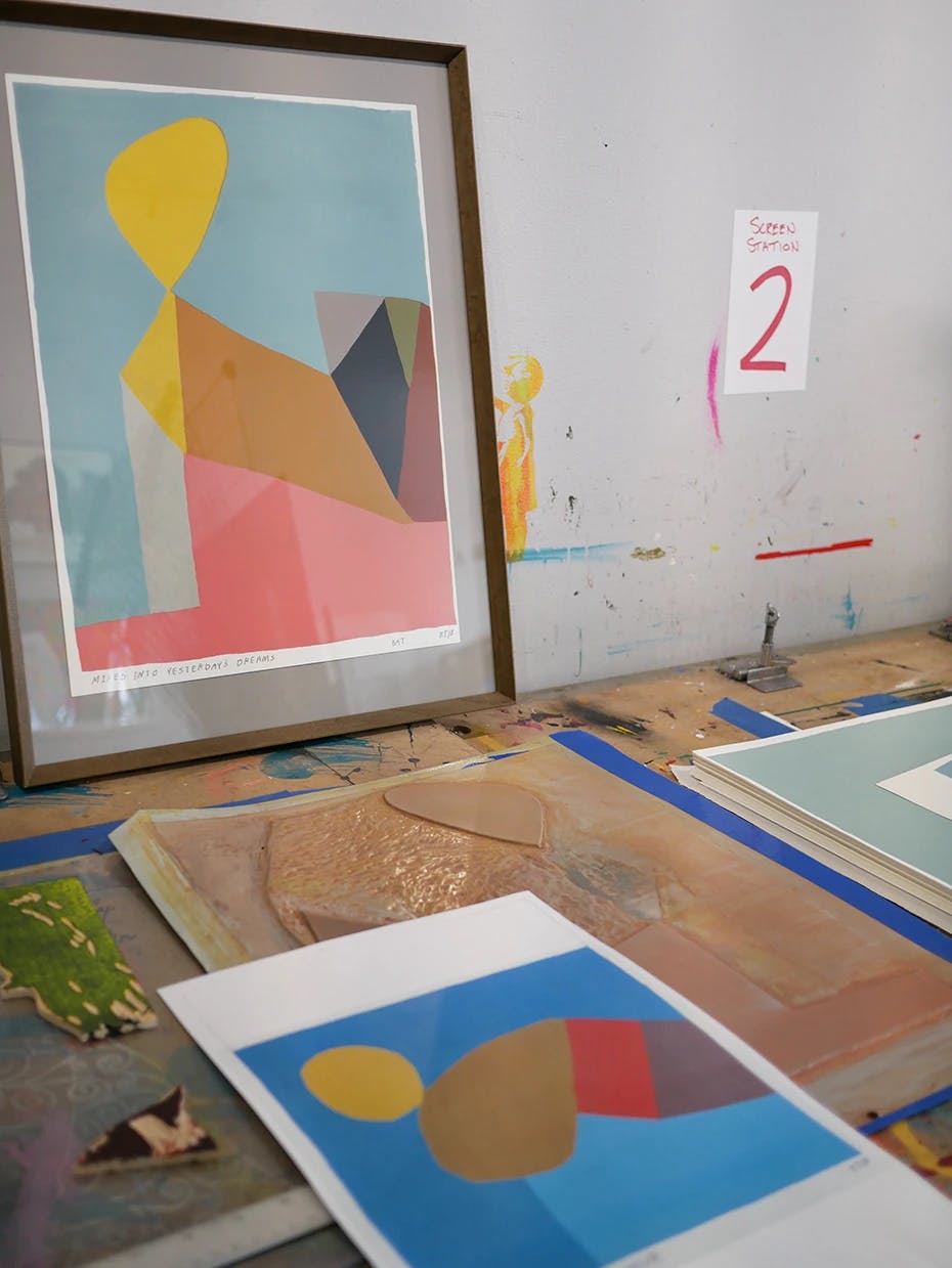
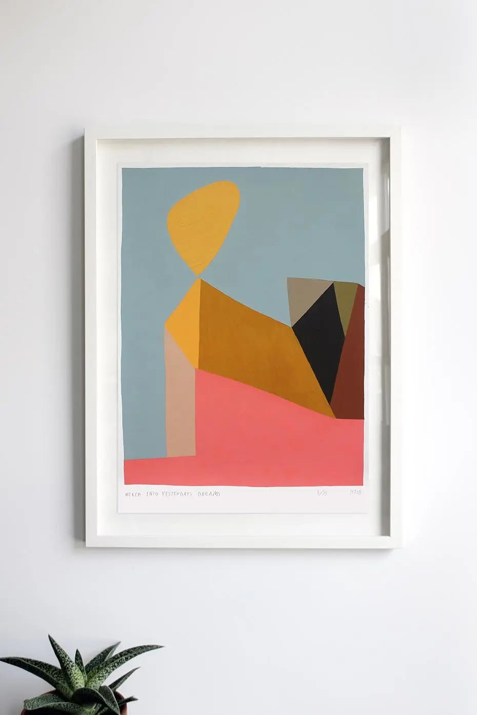
Kristin Texeira x Shoestring Press
Shoestring Press fashioned two ambitious, eight color reduction prints, where each successive layer of color represents additional carving into the original linoleum block, to produce a graphic limited edition of Kristin Texeira’s work, Mixed into Yesterday's Dreams and Sunset Blue Hour.
Considering which piece to translate into a limited edition print, the artist selected Mixed into Yesterday's Dreams since it was her "favorite piece from my time in Bisbee, AZ. Something clicked in me the day I painted it - it was very meditative and intuitive. Nothing was planned other than focusing on energy from the day before which was a mix of interacting with strangers followed by a series of fever dreams in and out of sleep."
Lane Sell, the founder of Shoestring Press, mentions "this piece has become an exploration in what could be called folk physics - balancing the working properties of ink and paper with pressure and coverage and the topography of carving to constantly adjust to the changing landscape of the reduction matrix. It's really appropriate that this landscape-flavored abstraction, with its reference to desert landforms forged by geological forces, should also make us as printmakers more deeply consider the landscape of the press bed and its counterbalancing forces, including the mind at work to harness those forces."
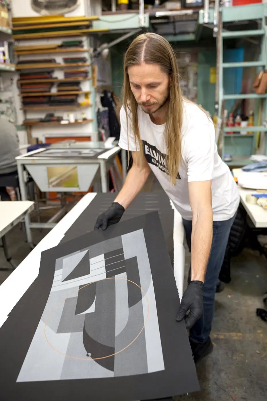
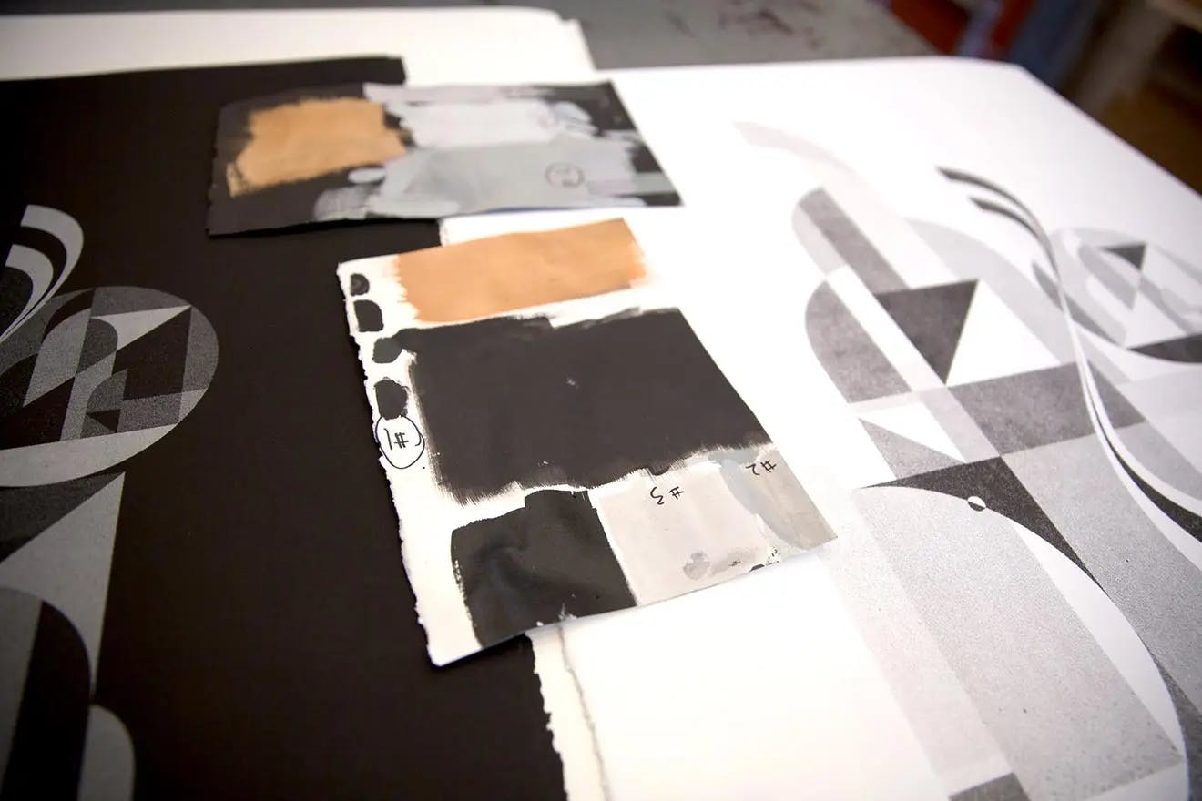
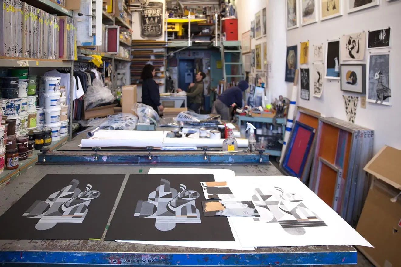
Tony Sjöman x Bushwick Print Lab
Bushwick Print Lab duplicated Tony Sjöman’s designs on white and black paper to create "Night" and "Day" versions of his works using grey and copper inks.
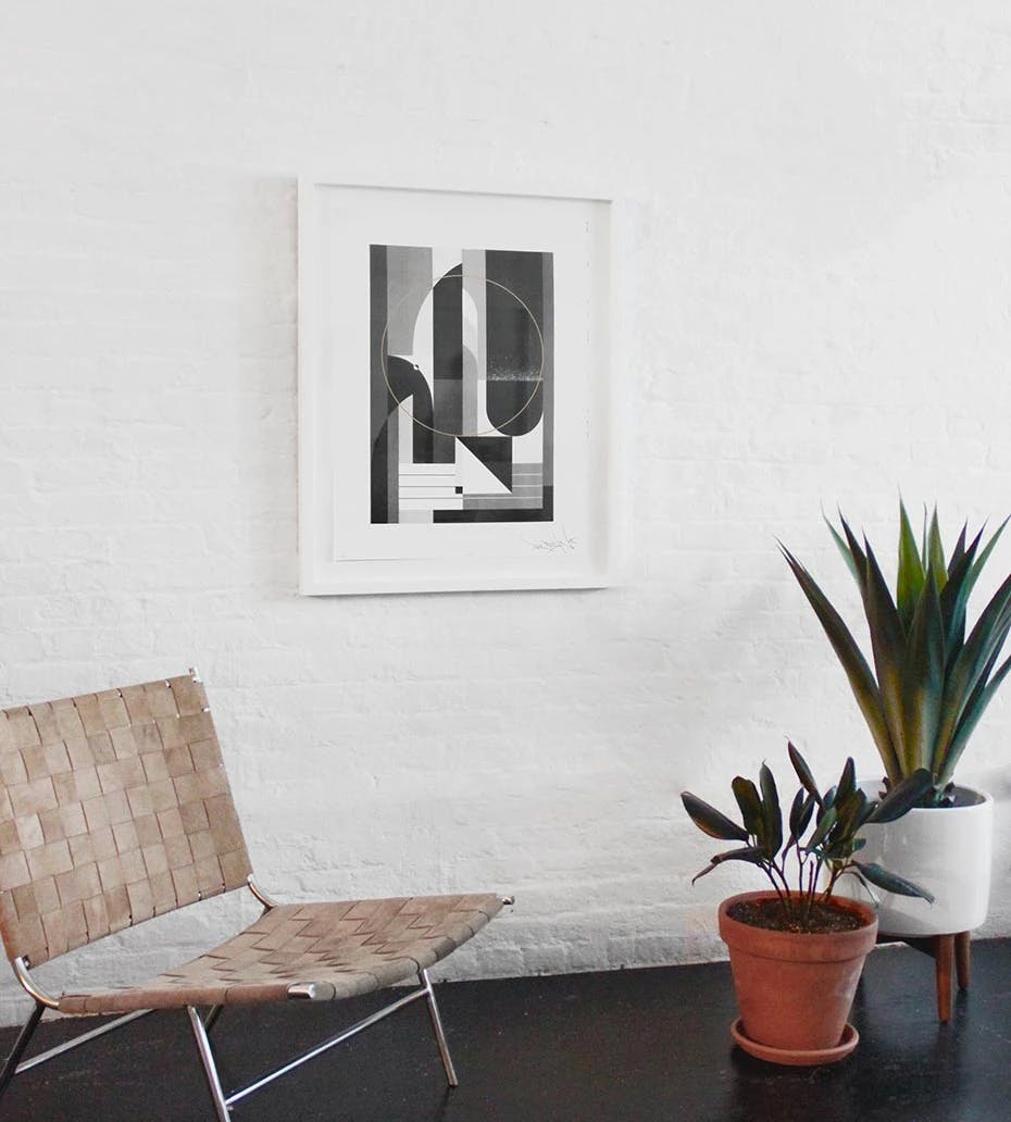
The artist describes key elements in the prints: "The past decade has been the most productive in my career so far and this collection is not only the result of the hours that I have spent on it, but rather a reflection of every work that I have ever created. The signature elements that I have been tweaking and re-tweaking for the past ten years have gained new perspective through reflection, making this collection a symbolic pit stop to the present day."
Jennifer S. Harris and Ray Cross of Bushwick Print Lab go on to mention that "Tony has a strong and beautiful artistic vision that we are thrilled to translate through the medium of screen printing. His warm geometric composition is refreshing and he we sincerely enjoy working with him."