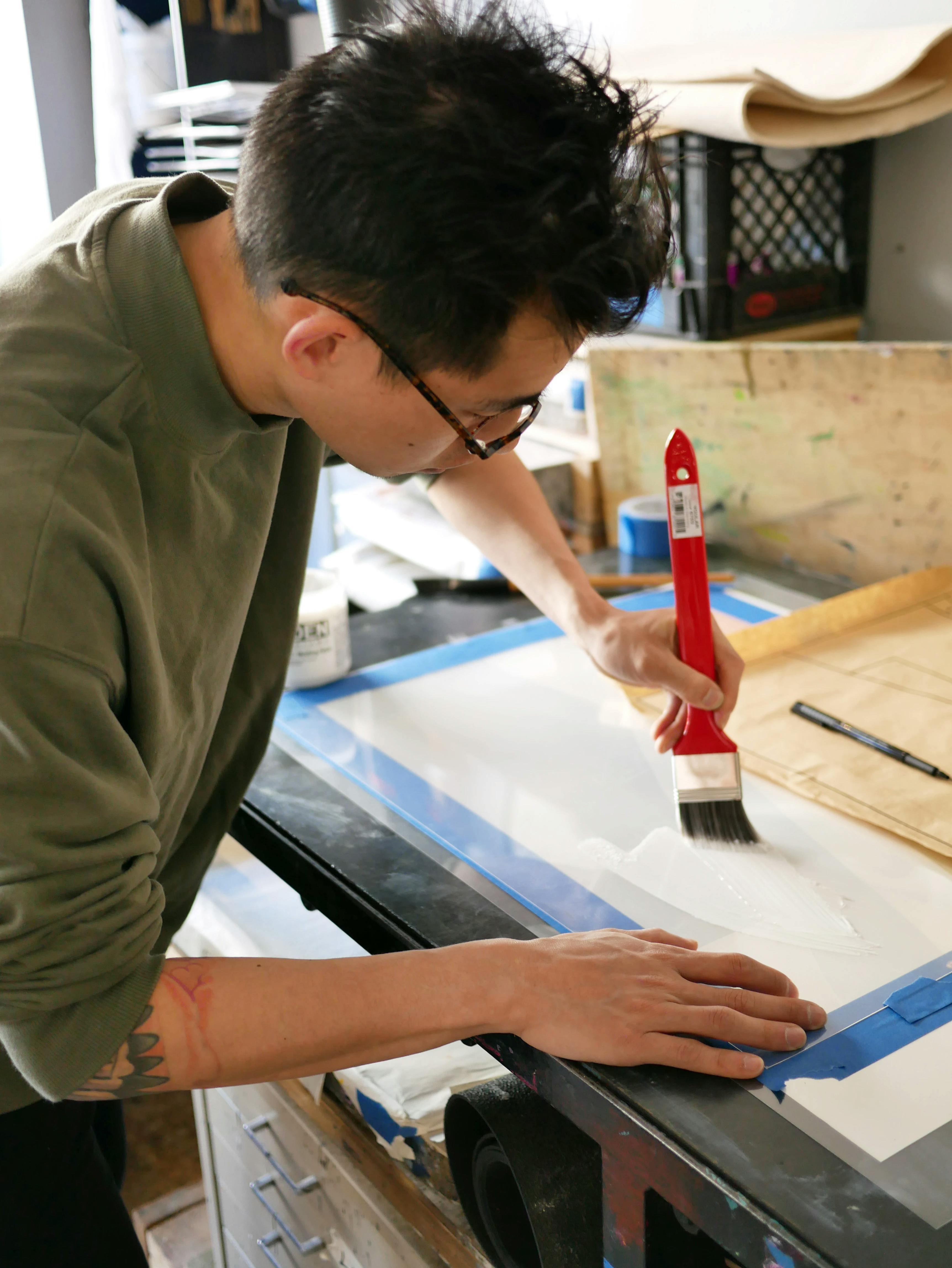
Behind the Print Series / Edition 2
For Edition 2 of our Print Series, artists Chad Kouri, Scott Sueme, and Senem Oezdogan created limited-edition prints in collaboration with three Brooklyn print studios. Exclusive to Uprise Art, these prints feature unique elements such as silver leaf foil and blind embossing.
Go behind the scenes with each artist as they worked with the printmakers to bring their original piece to life.
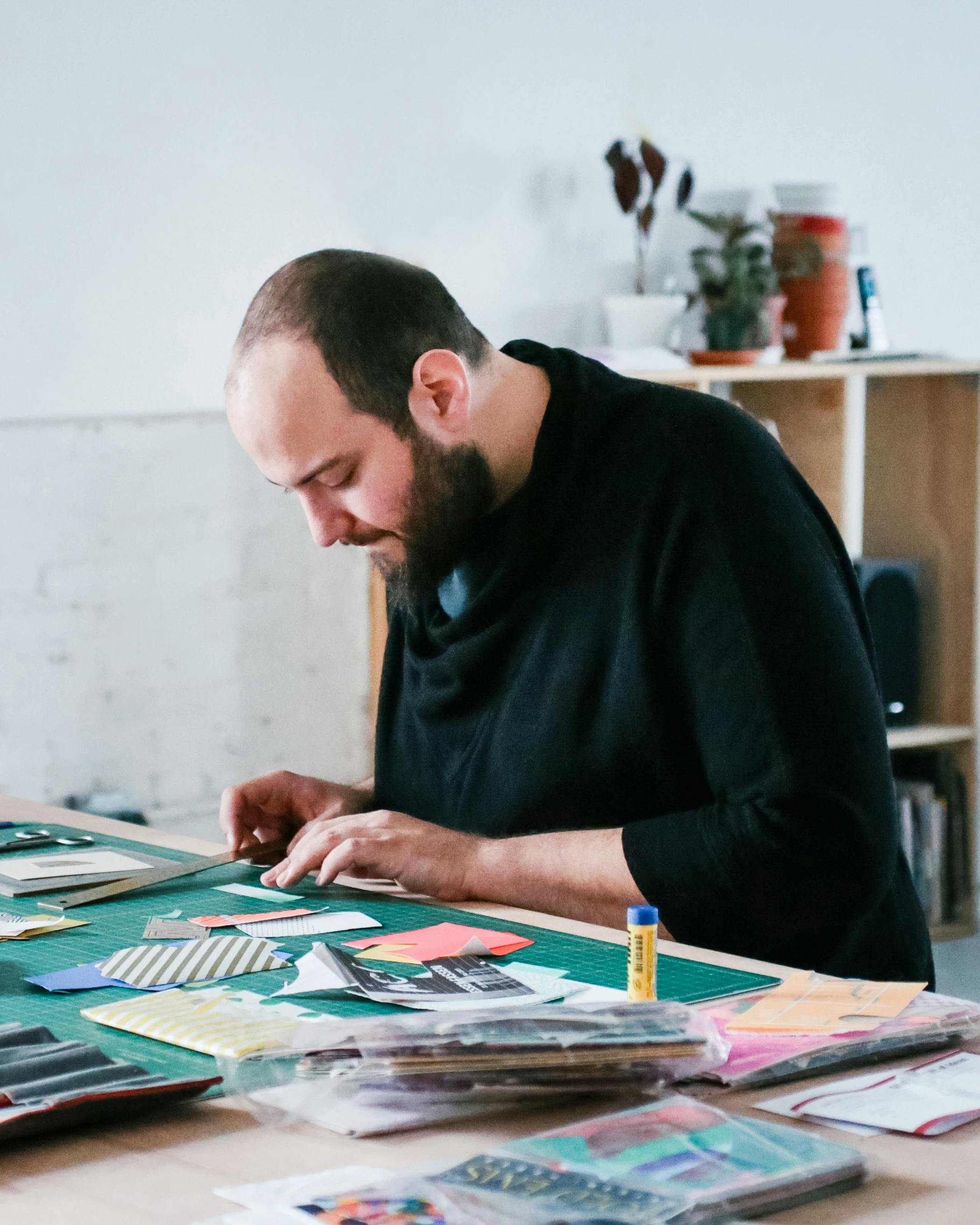
Chad Kouri, Opportunity for Reflection (Yellow)
Chad Kouri's Opportunity for Reflection (Yellow), created in collaboration with Haven Press Studio, incorporates a silver metal leaf layer that allows the viewer an opportunity for reflection, as well as a shifting element that changes based on its surroundings.
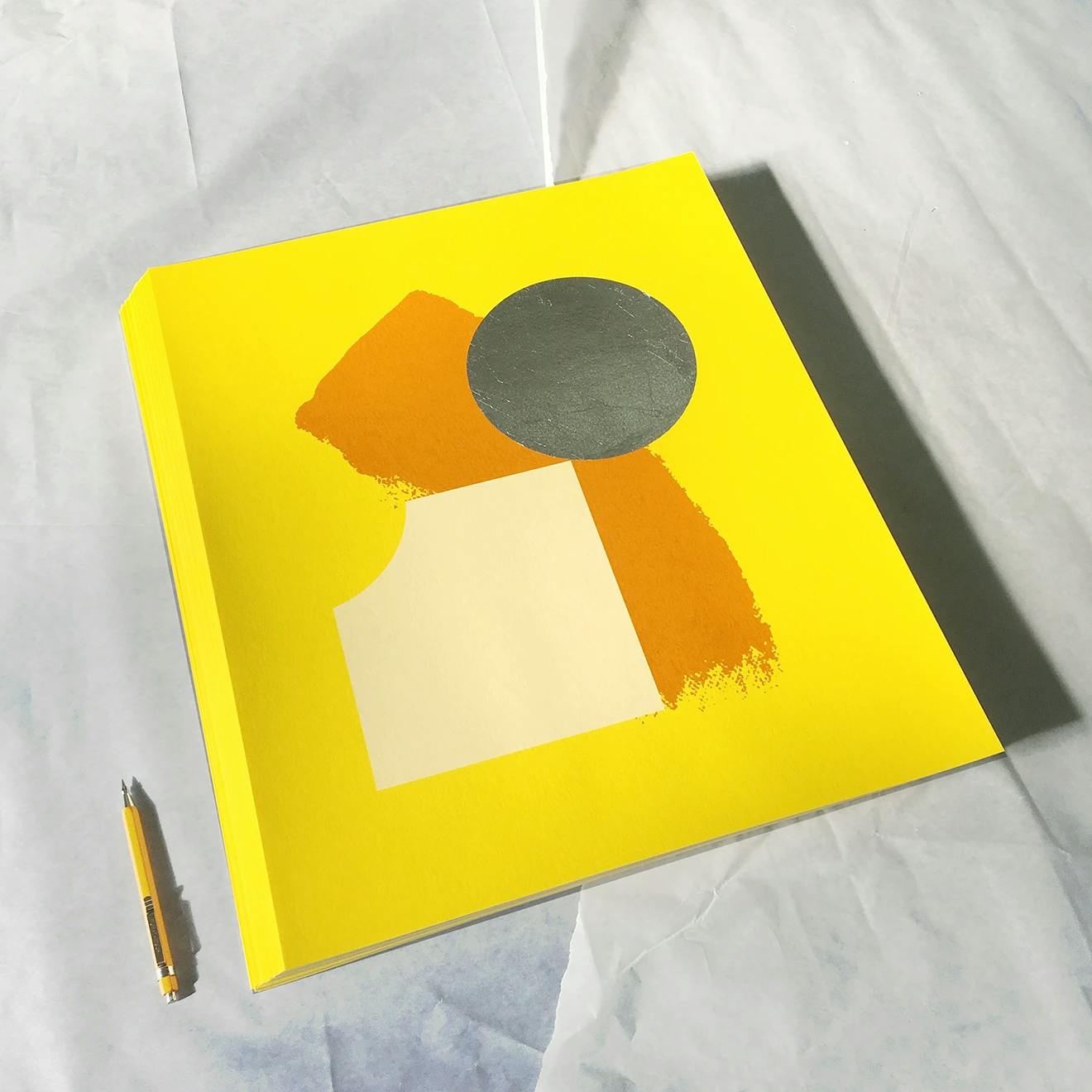
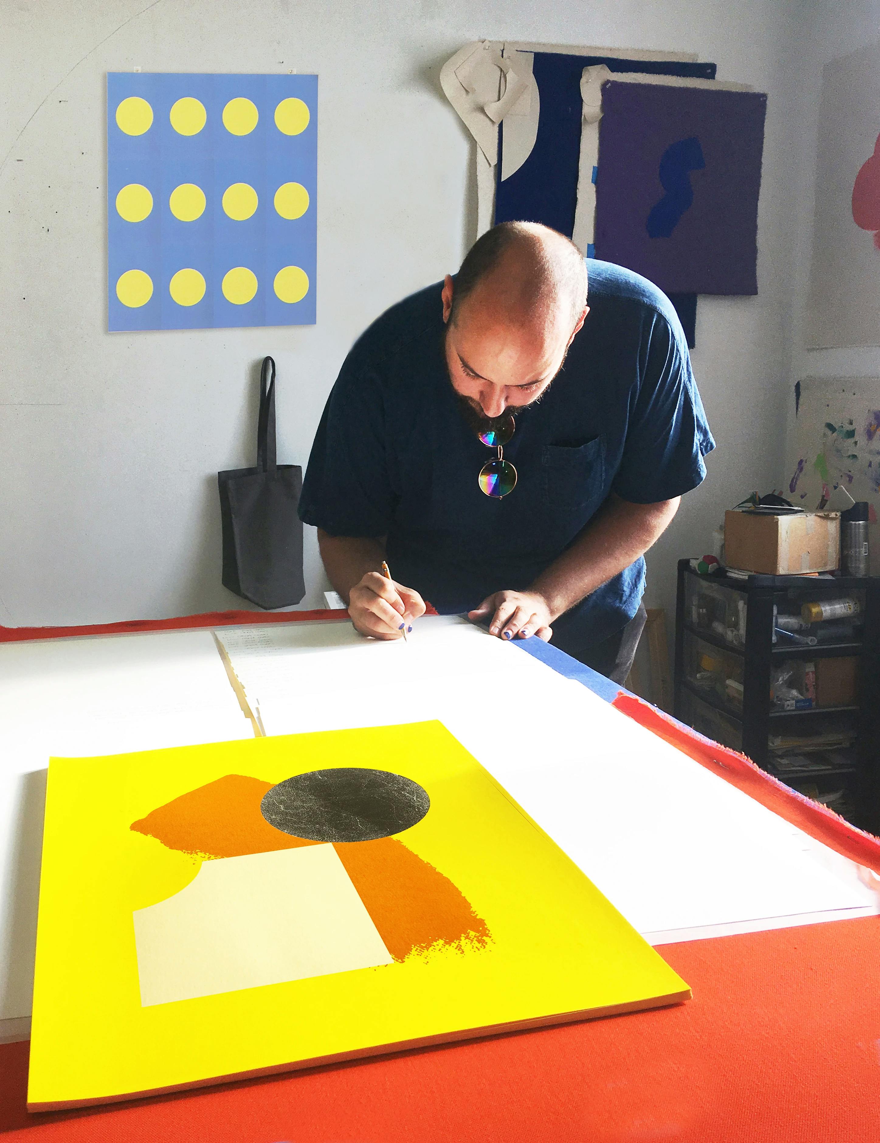
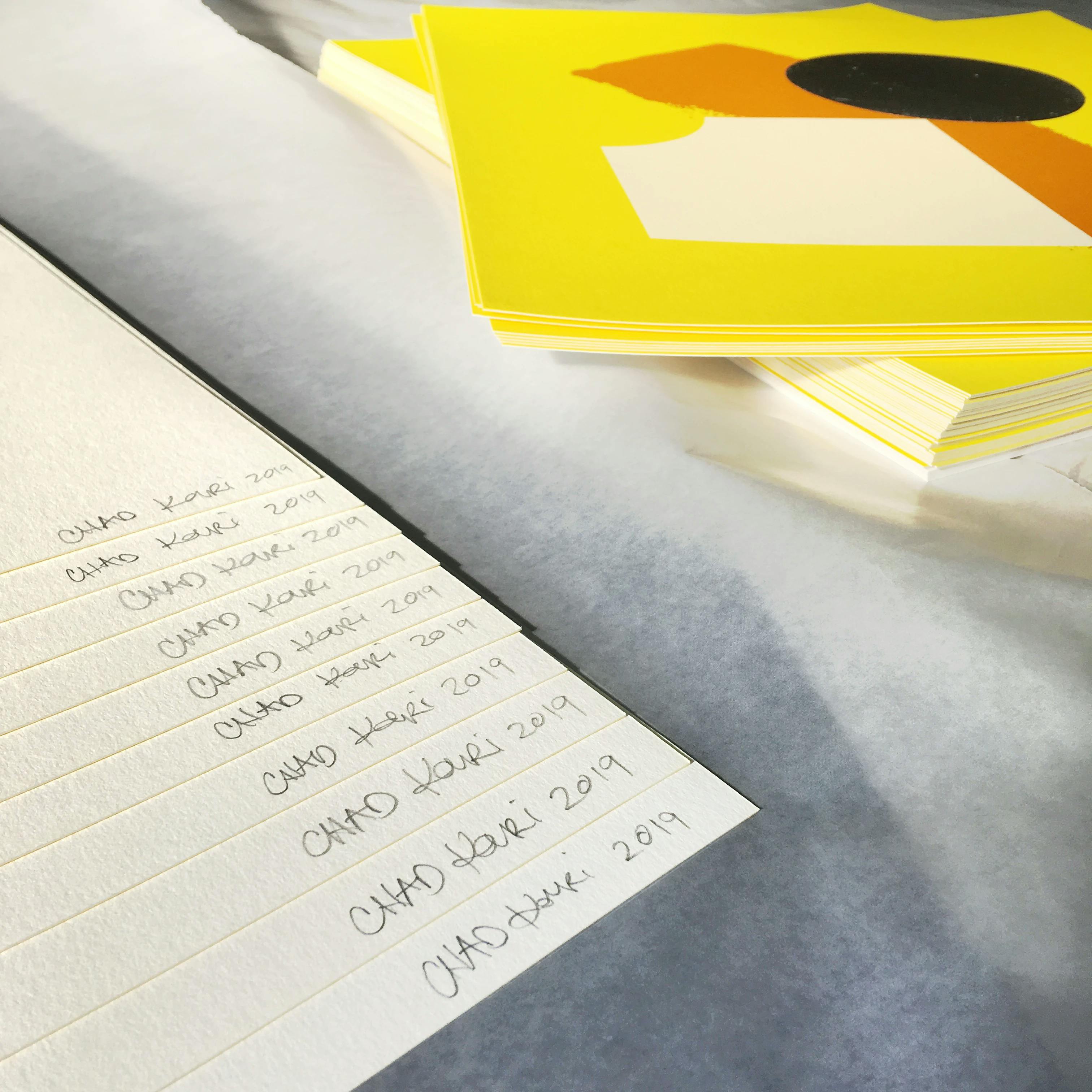
Chad elaborates on the design: "This edition is an extension of the new body of work I showed at Subliminal Projects, which was the first grouping of work I've exhibited that utilizes reflective materials in the paintings. I've always wanted the viewer to 'see themselves' in the paintings I make, i.e. use their past experiences to find familiarity in the work, prompt introspection, and so on. So using reflective material makes it so the viewer can literally see themselves! It also means the works change depending on the room they are hung in, or the angle they are looked at."
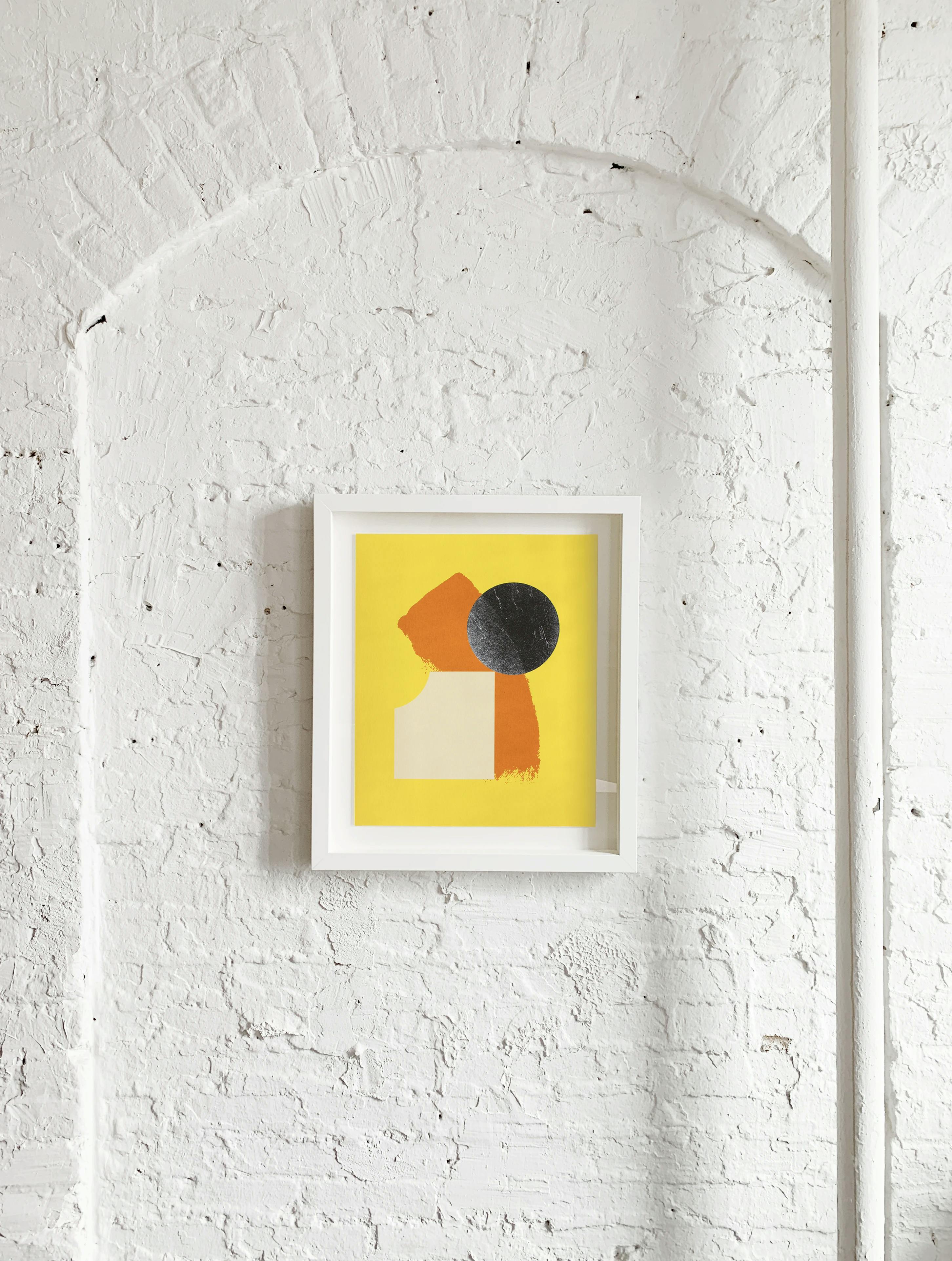
Scott Sueme, Traces/Places
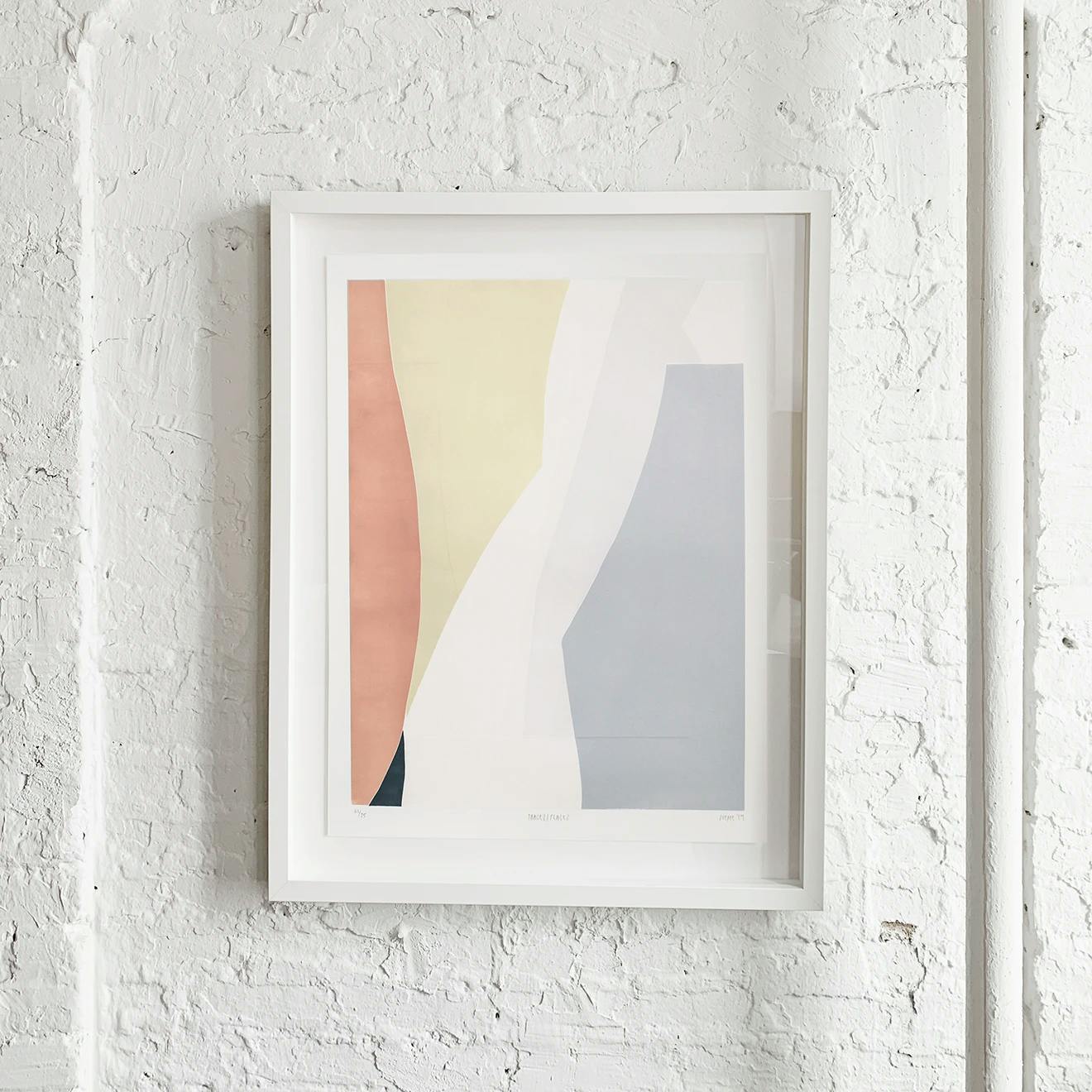
Scott Sueme's Traces / Places focuses on subtle color combinations that were achieved using a jigsaw method of relief printing. Created with Shoestring Press, the print includes an emboss that echoes the texture of the mark-making in Scott's paintings.
Scott describes his ideal composition as possessing "an equality of foreground and background, almost as if nothing is in front of, or behind. I wanted to explore this idea further in the process of a woodblock print as the blocks themselves are like cut-outs, fitted together like a puzzle to create the print."
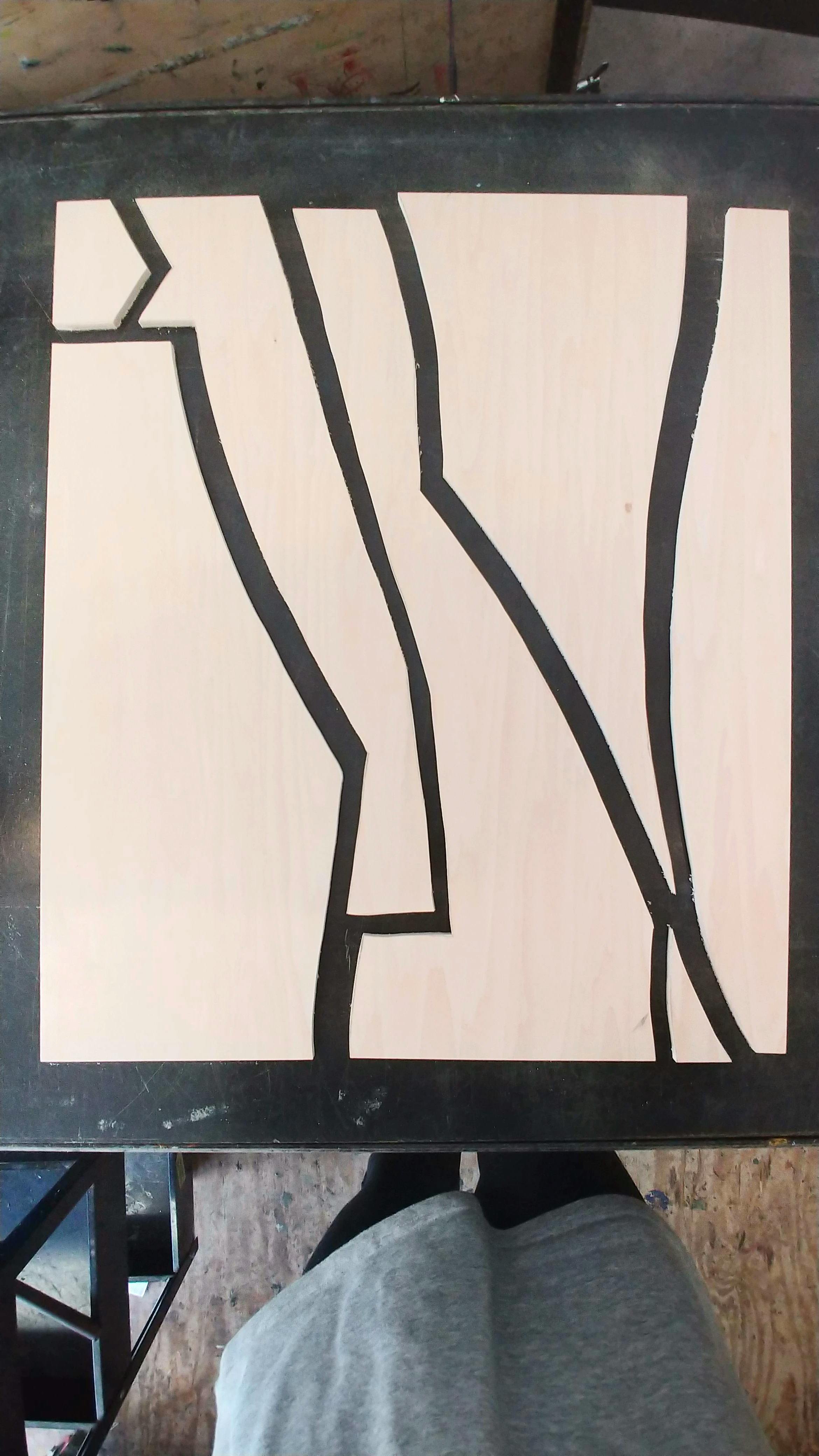
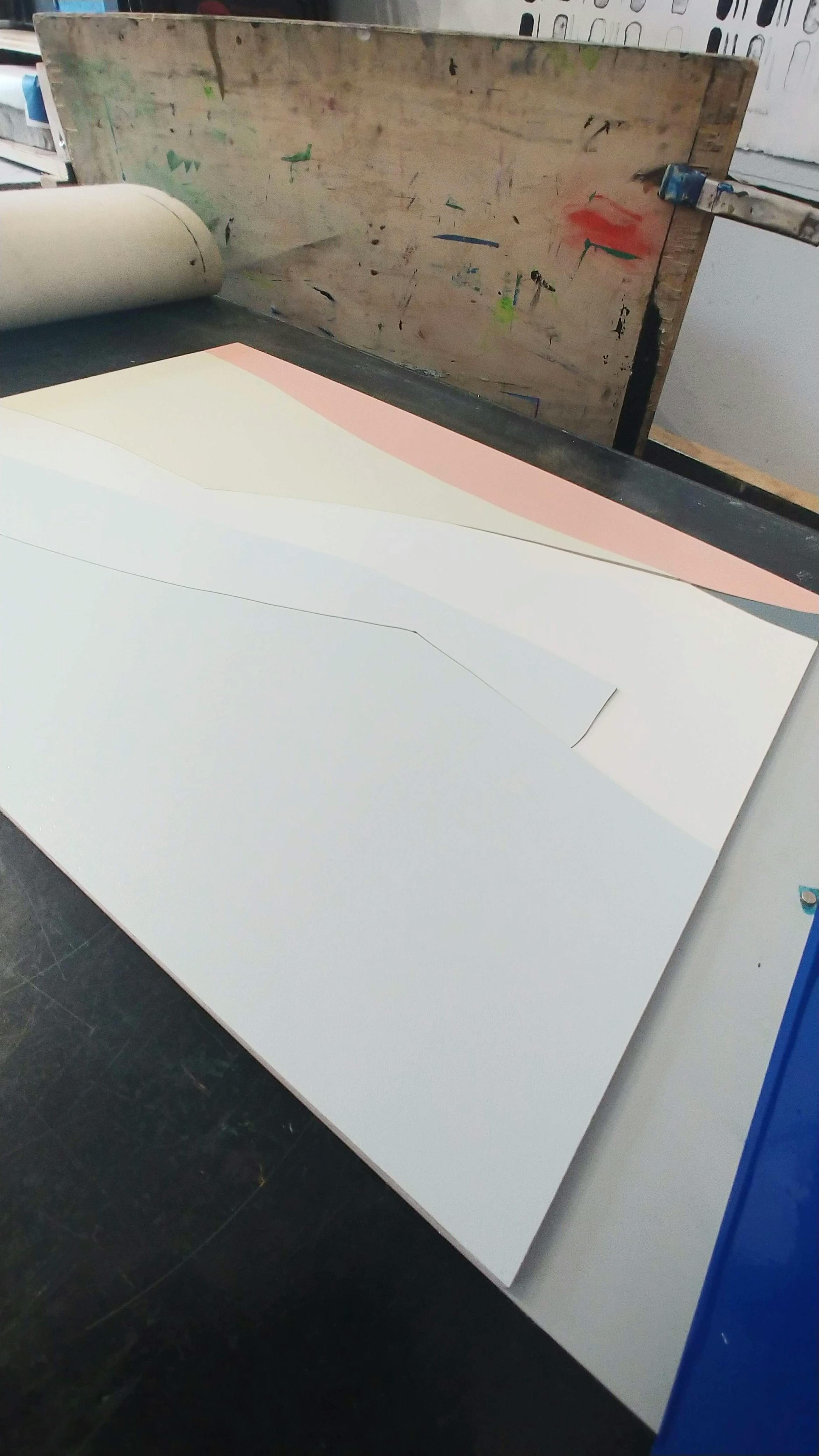
Scott elaborates on the process: "I also feel that any opportunity for me to use wood calls to the natural resource of the Pacific Northwest where I’m from, which has always felt like a natural gravitation for me. Working with Lane at Shoestring Press, we were also able to mimic the qualities of the underpaintings that exist in my artwork, where the edges of overpainted shapes reveal themselves on the surface. We did this using cut paper, and embossing the paper after printing the colors."
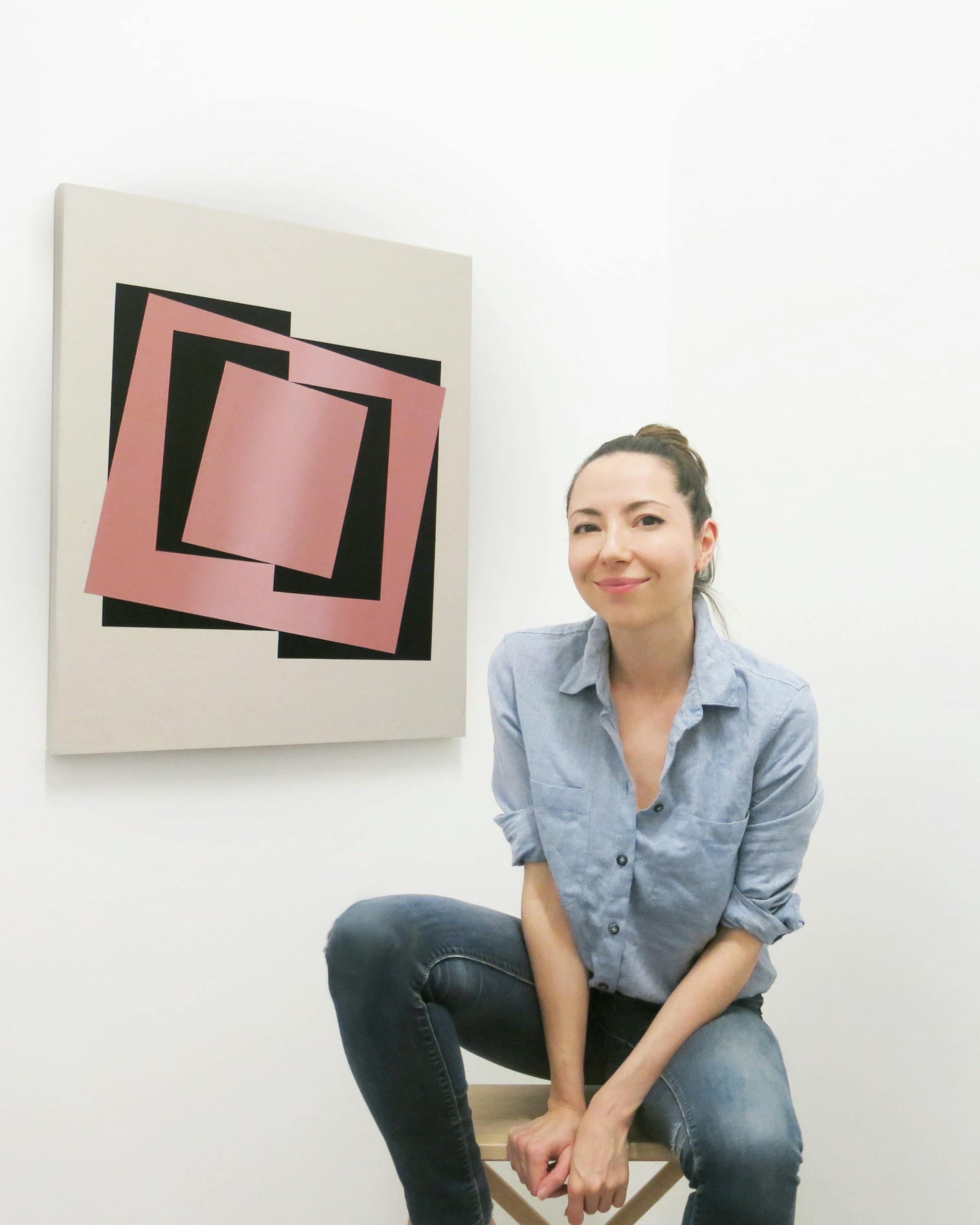
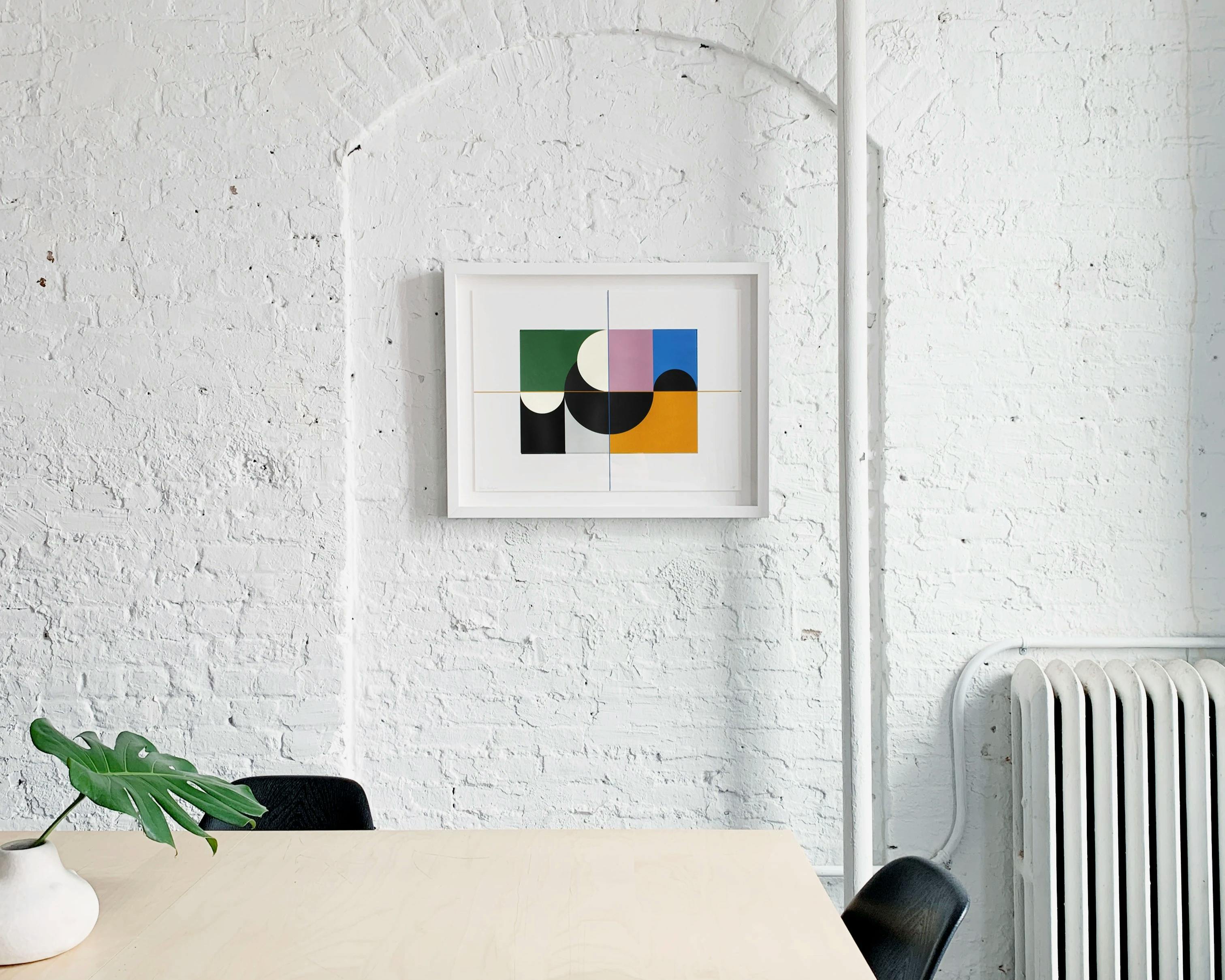
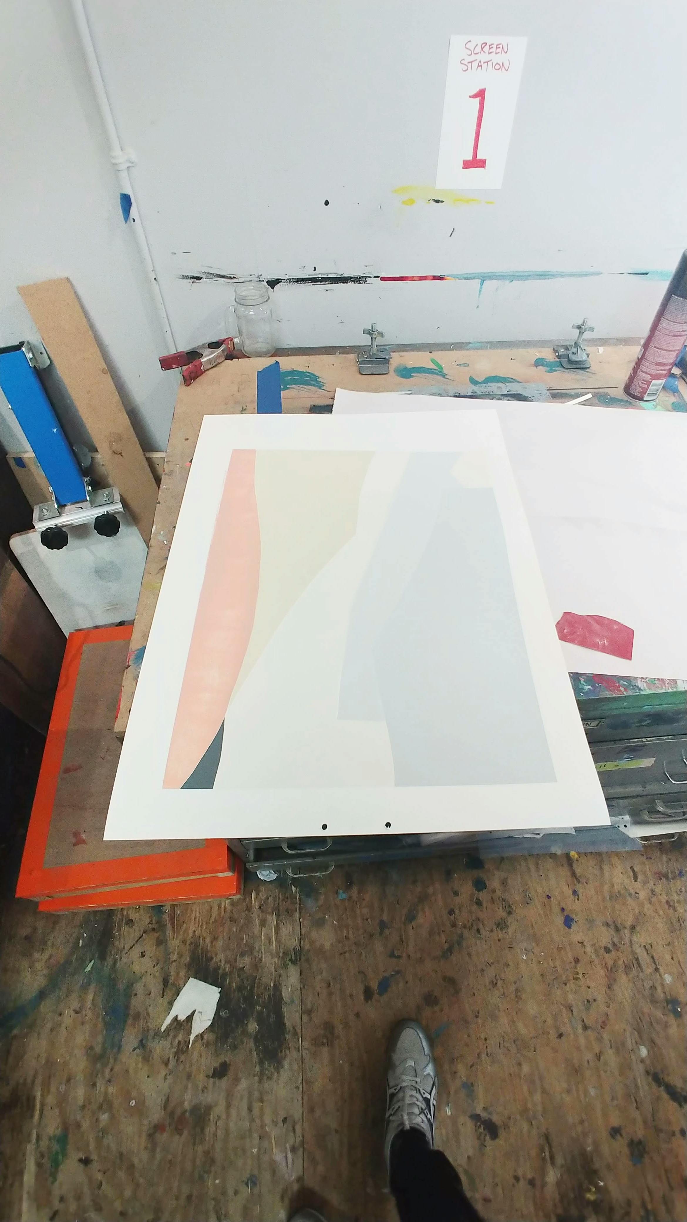
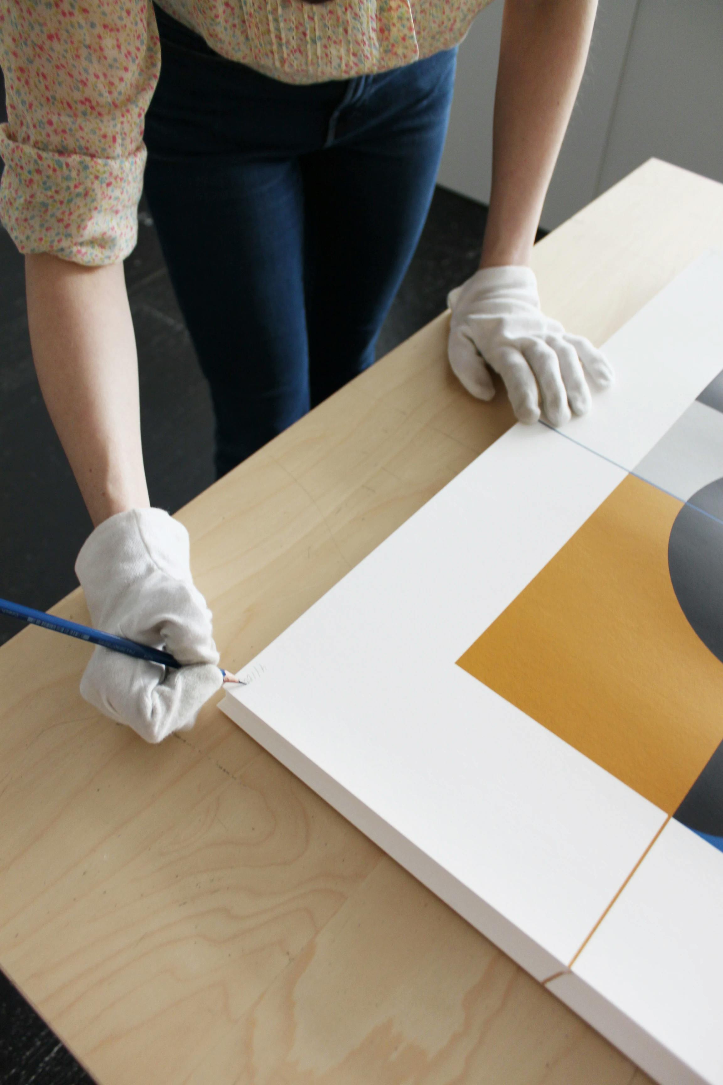
Senem Oezdogan, Milano
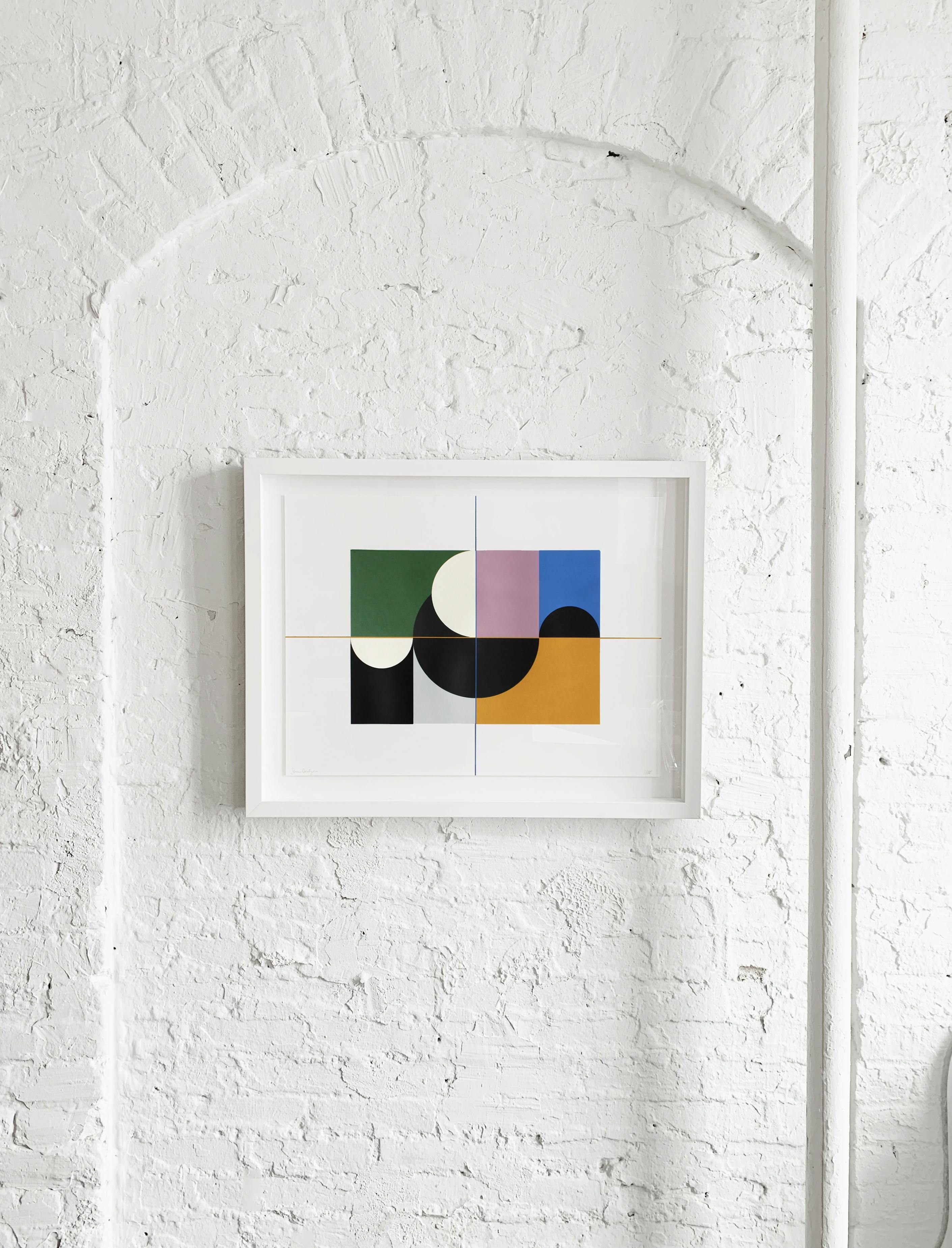
Haven Press and Senem Oezdogan worked closely together to create Milano, a six-color screenprint on paper that pulls from the colors of Renaissance painting as well as Milan's diverse architectural styles.
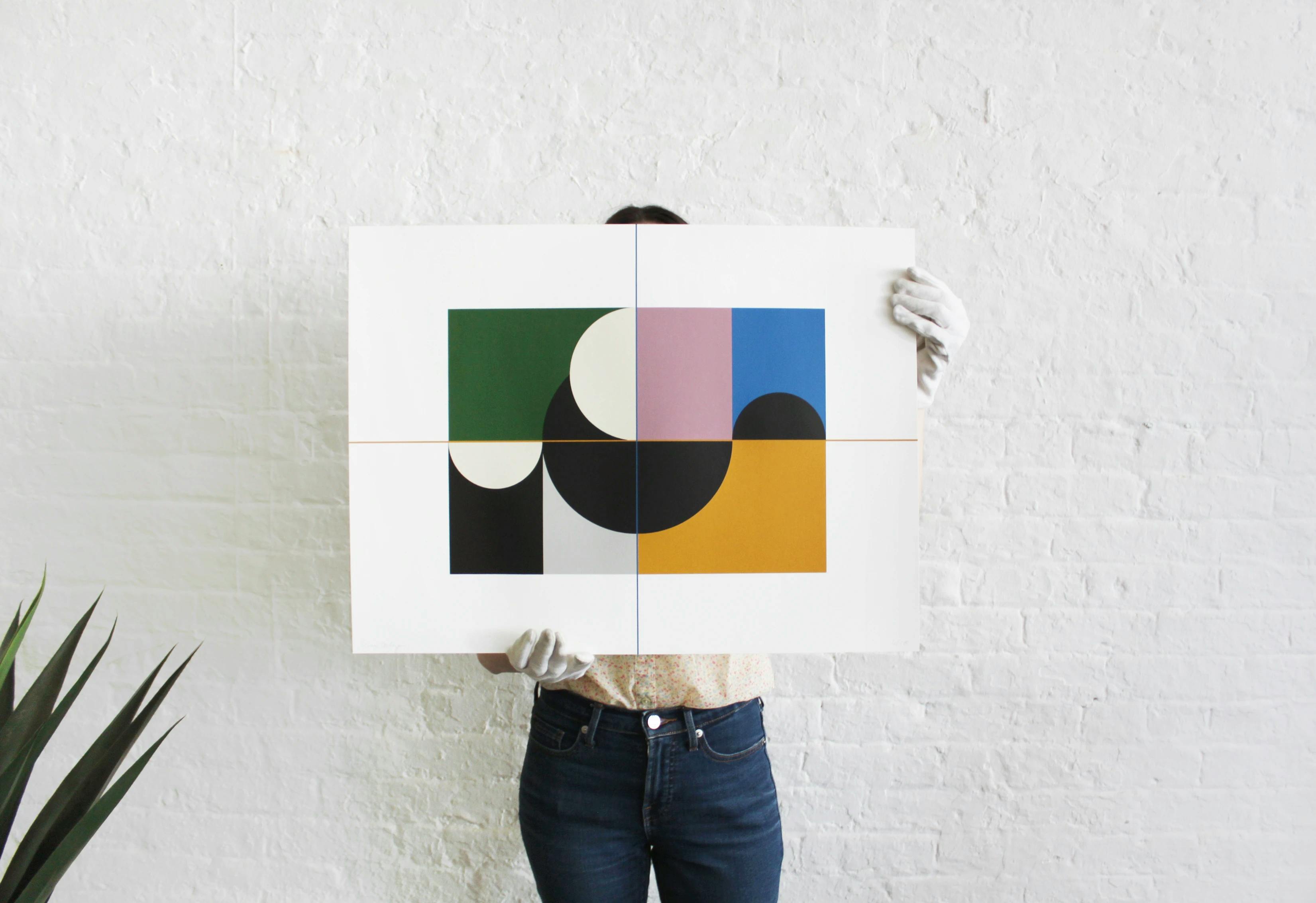
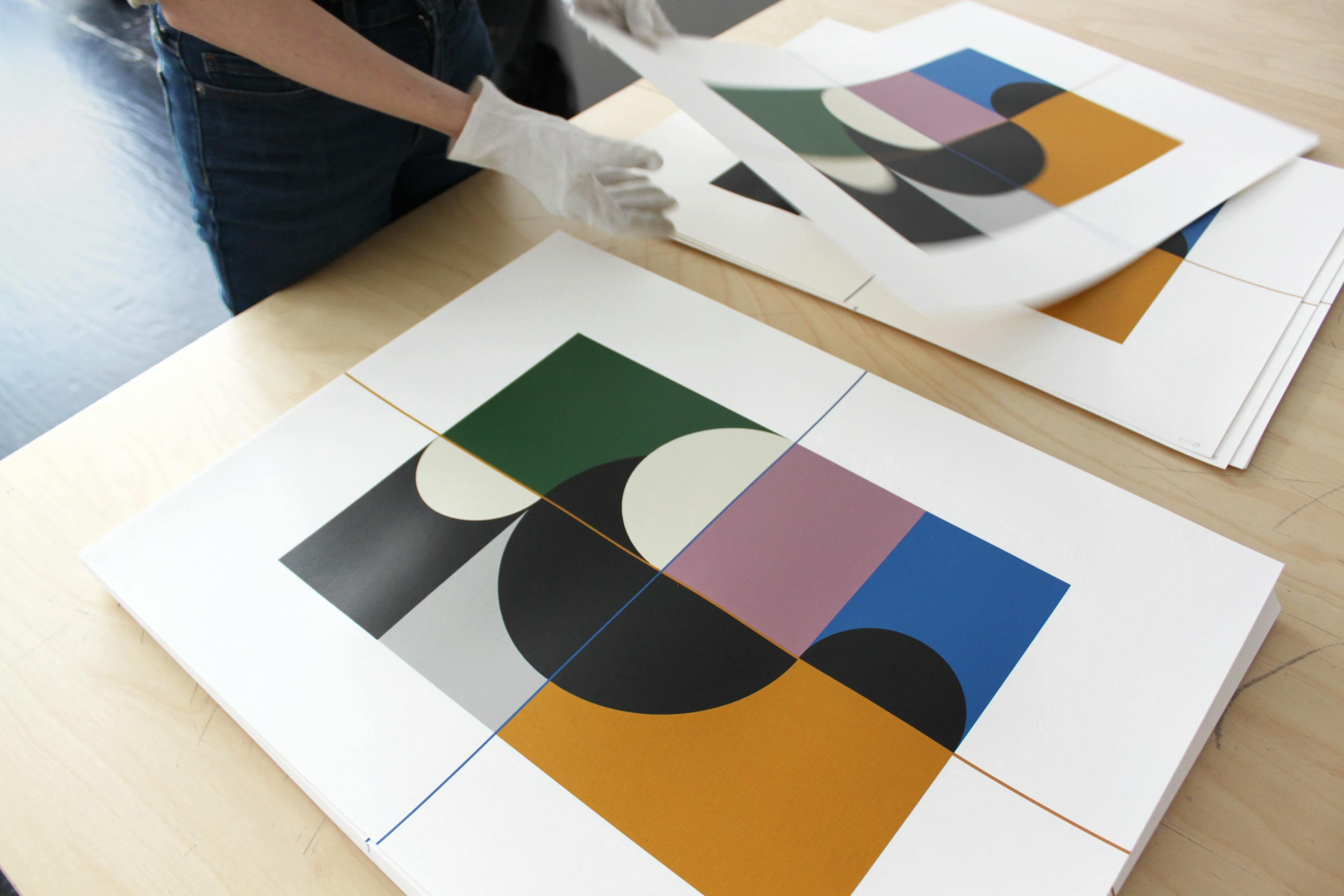
Senem points to the inspiration behind the work as "Renaissance painting as well as Milan's diverse architectonic styles - from its neoclassical structures to the wide variety of modernist designs. The strong contrast in colors in this print is based on my interest and studies of chiaroscuro and its application in Renaissance painting. The exploration of light and dark contrasts and their impact on the viewer's perception are important aspects of my work."
Learn more about the process behind Print Series / Edition 1.